The yogurt with the black stripe
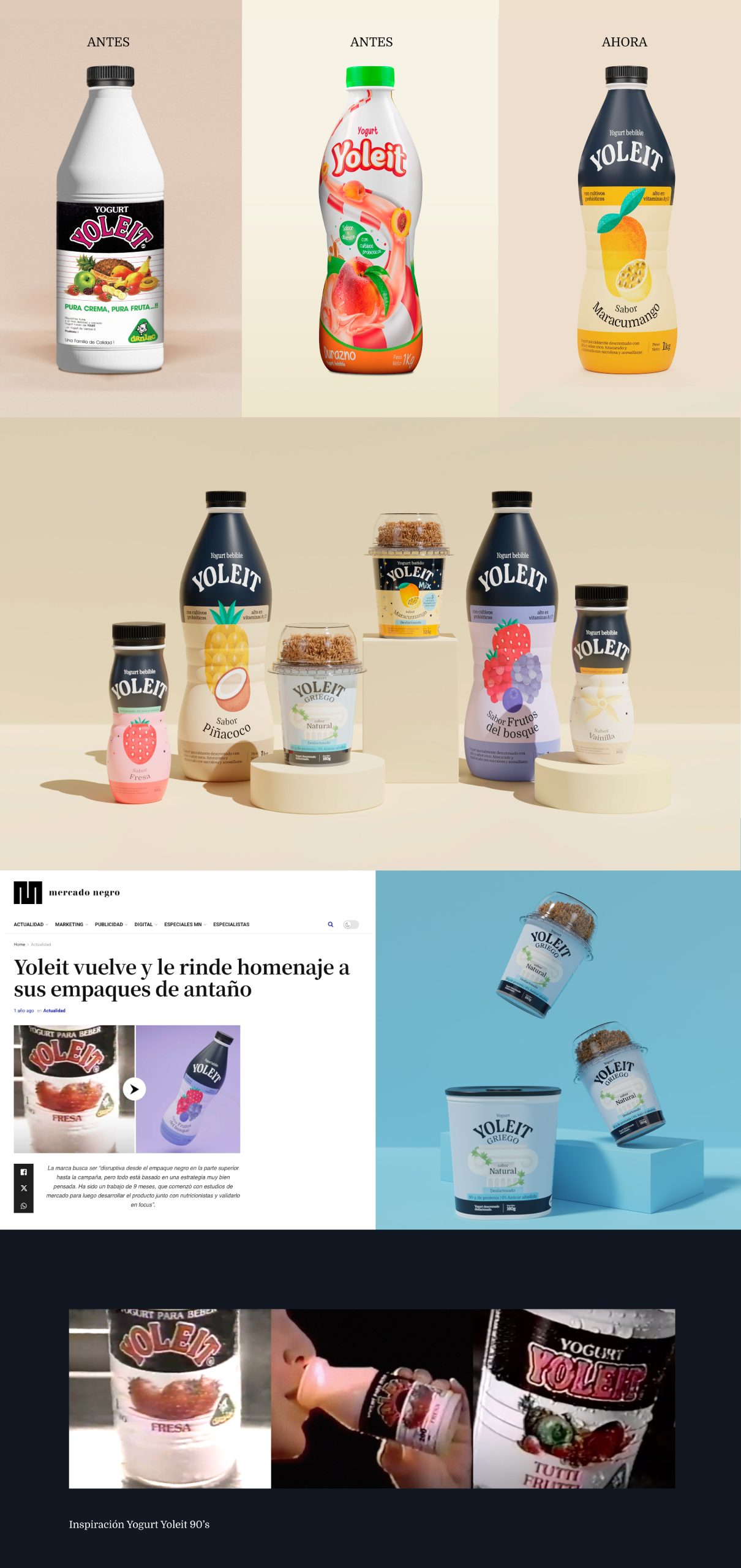
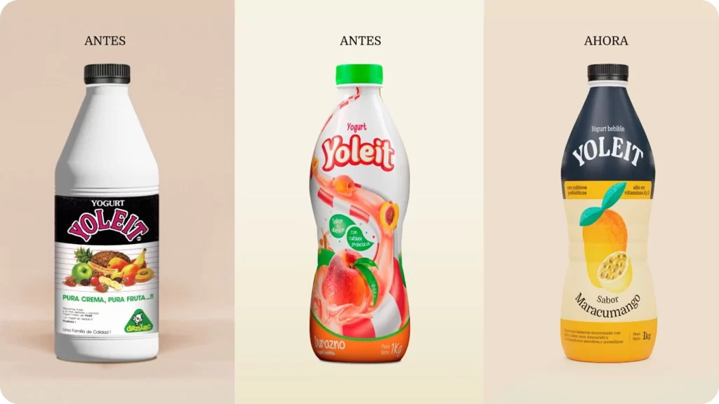
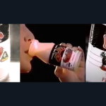
We did research that inevitably led us to the concept of nostalgic memory as a starting point. We did visual archaeology to decipher the elements of its old packaging, watched the commercials of yesteryear and turned to our own memories. And when we did, we remembered that Yoleit had a black stripe, something very peculiar that nobody was using, neither back then nor now. Yoleit had been the yogurt with the black stripe, and that was one of the things that made it iconic in its day. We started from there to propose a differentiating visual identity that drew on its own history.
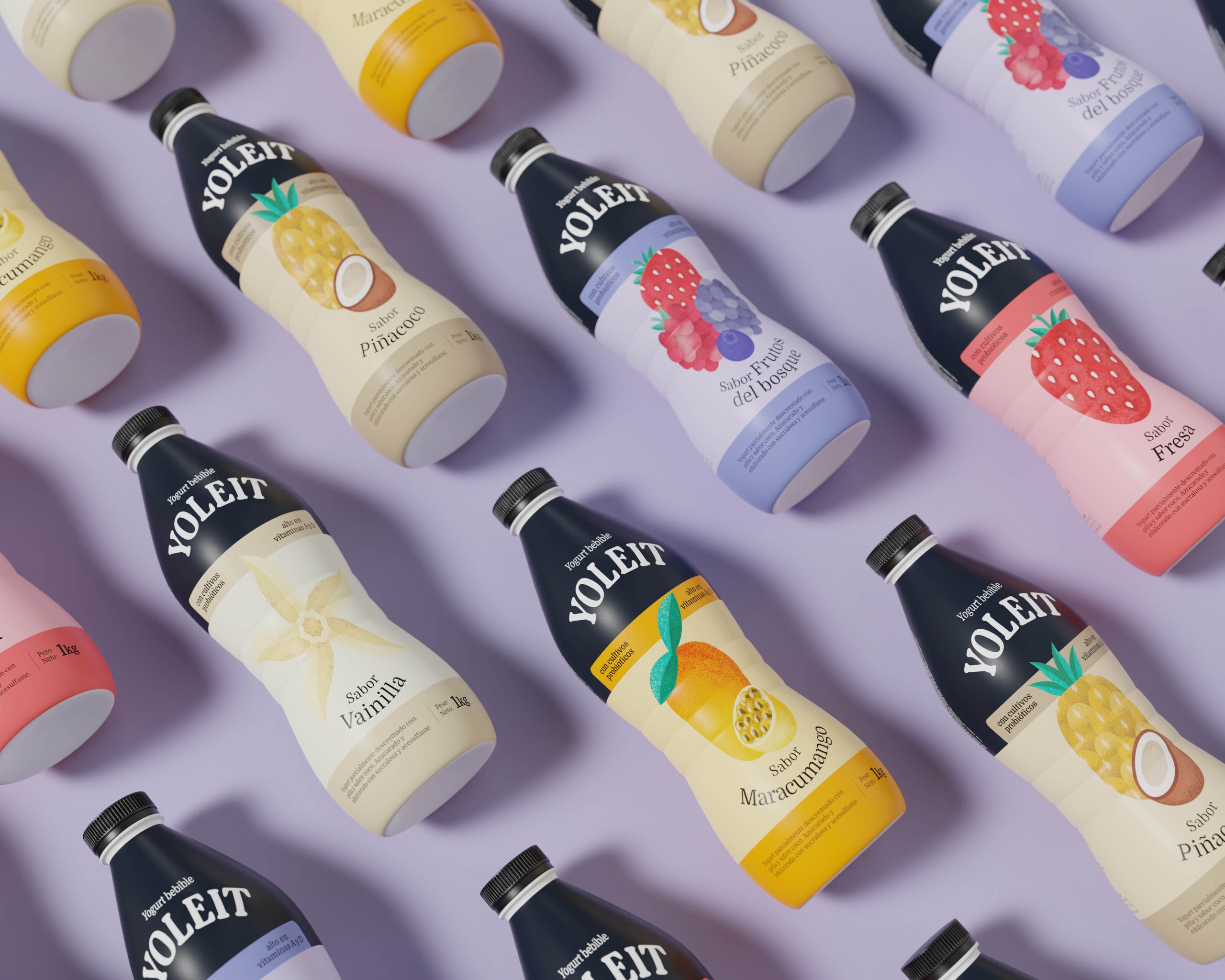
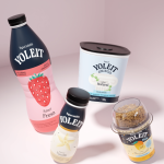
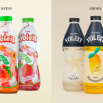
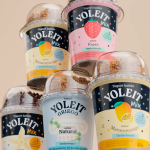
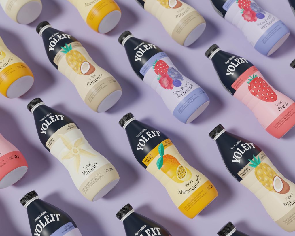
We brought its distinctive black stripe into the present in a very contemporary way, and at the same time created new visual codes that stood outside the usual world in which many Peruvian yogurts live today: the use of the splash and photographs of fruit. That is why we decided to use illustrations, changed the typography and raised Yoleit’s presence with a more modern package that nodded to its history.
On the other hand, we had to create a visual identity flexible enough to launch new flavors and product lines without losing the essence. We created visual guidelines that are easy to identify and replicate when creating new products, so its portfolio can grow in an orderly and coherent way.
Knowing very well the battle for consumers’ attention that takes place on supermarket shelves, we achieved a noticeable change in the packaging that has had a positive impact and made a difference at the point of sale. In fact, part of the reason supermarkets opened their doors to them again was this renewed image, hungry to reconnect with its audiences.