
Services
- Strategy
- Visual Identity
- Web Design
- Strategy & Creative Director: Daniela Nicholson
- Design Director: Jose Bernal
- Graphic Designers: Angelo Guillen and Romina De’ Luise
- Project Coordinators: Thiara Cobos and Eliana Garcia
Industry
- Real State
Many brands talk about quality. But not all of them can prove it.
When we worked on the branding for Marcan Inmobiliaria, we realized that its main differentiator was already embedded in the way the company worked: a meticulous, innovative real estate developer constantly looking for ways to improve each project. Not only by thinking about the people who would live there, but also about how every development could contribute to its surroundings and neighborhood.
The challenge behind Marcan’s rebranding was to make its visual identity reflect that same level of care and attention.
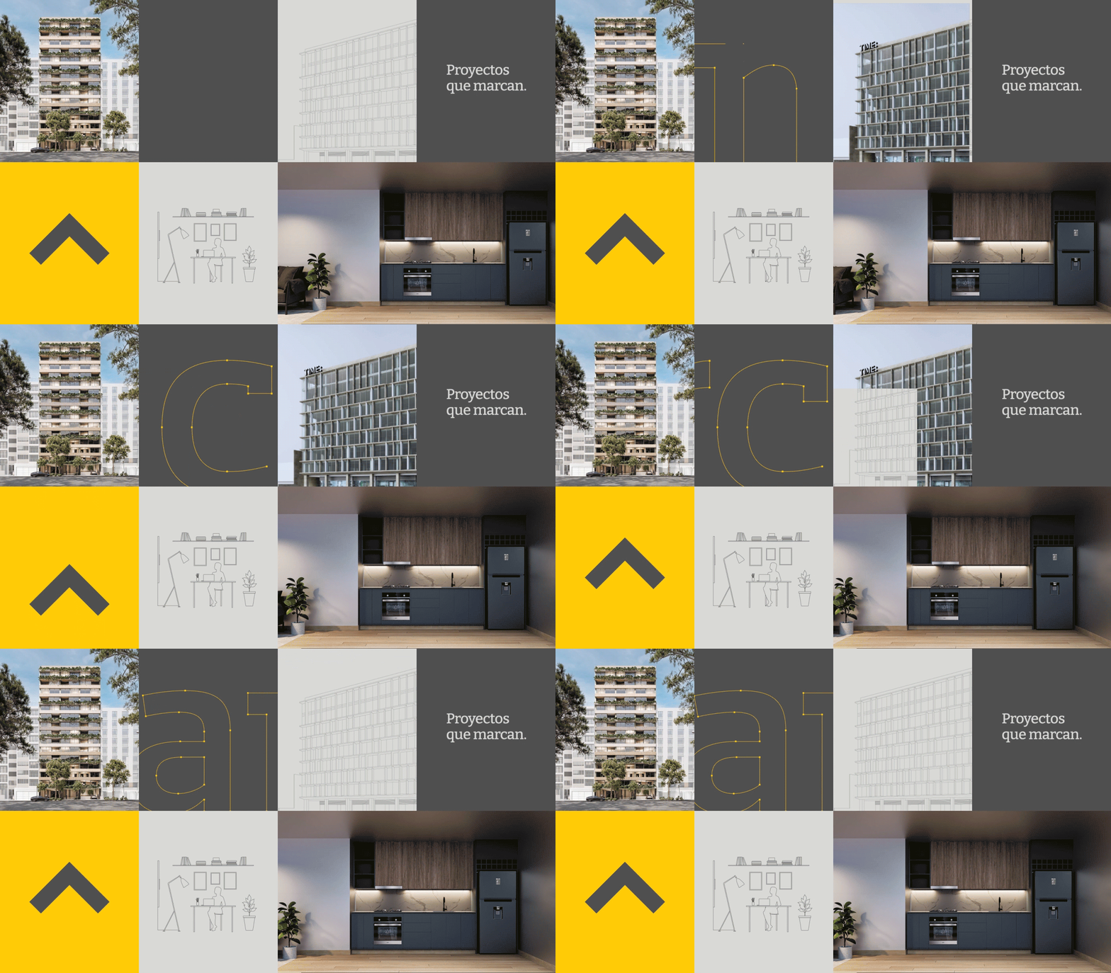
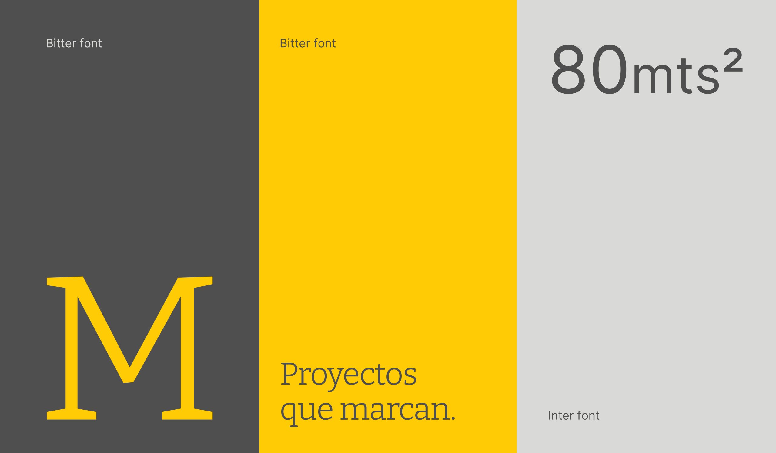
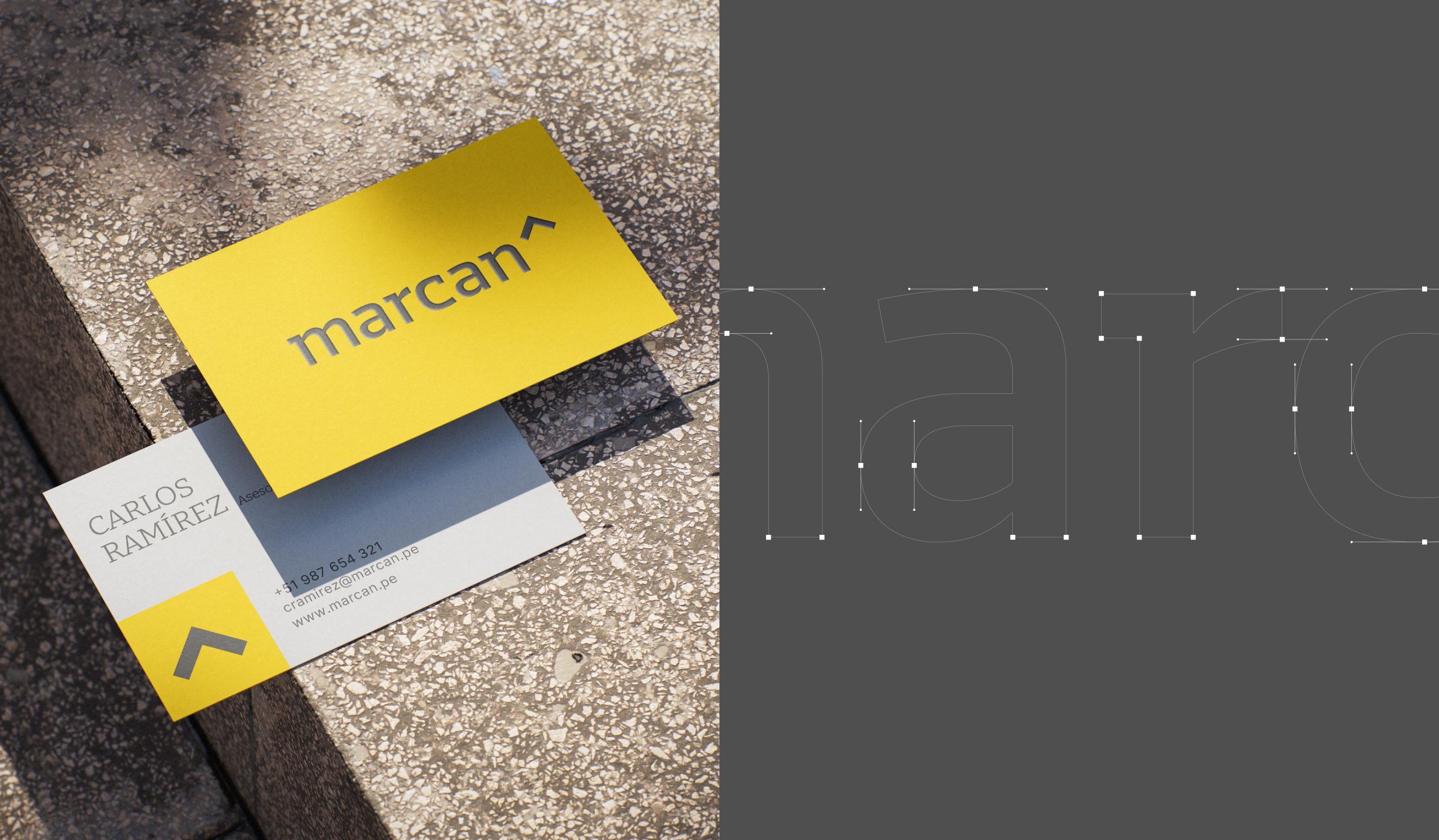
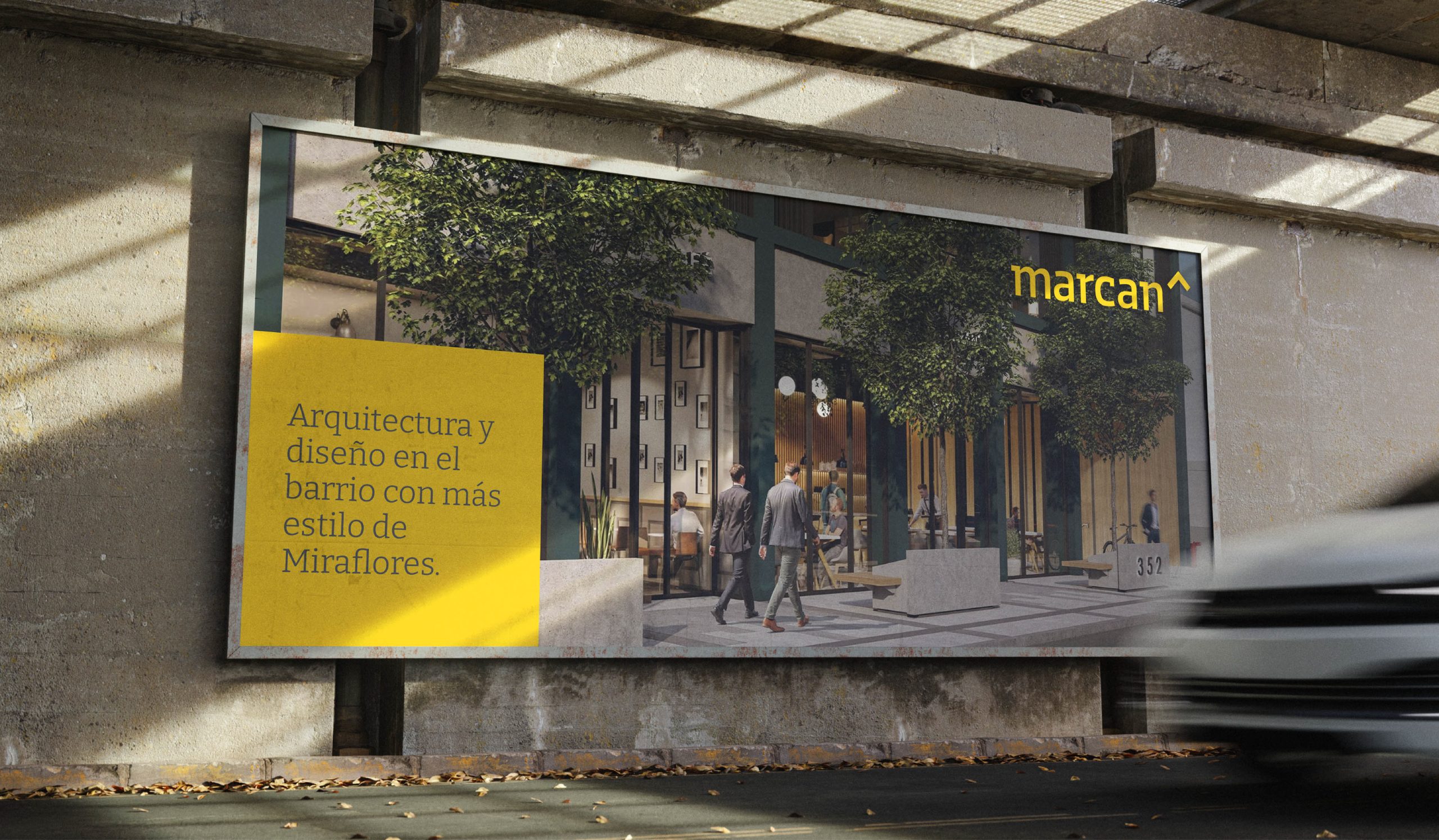
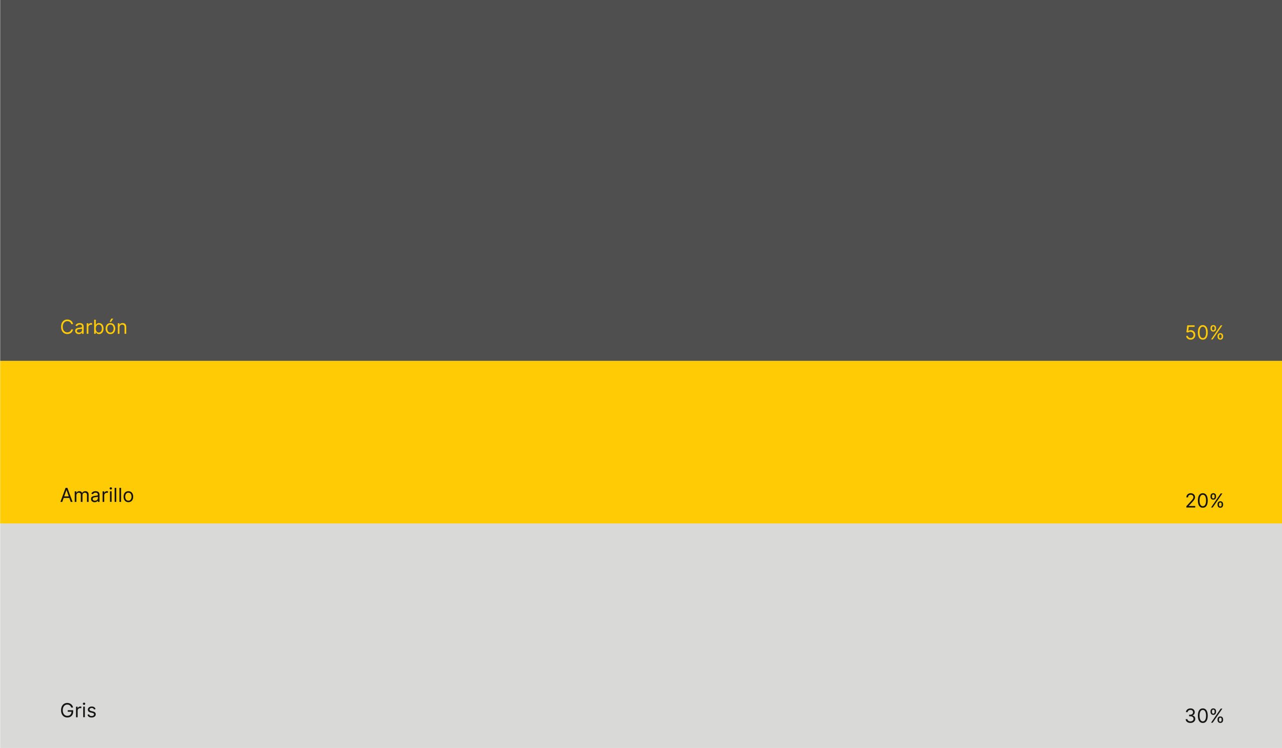
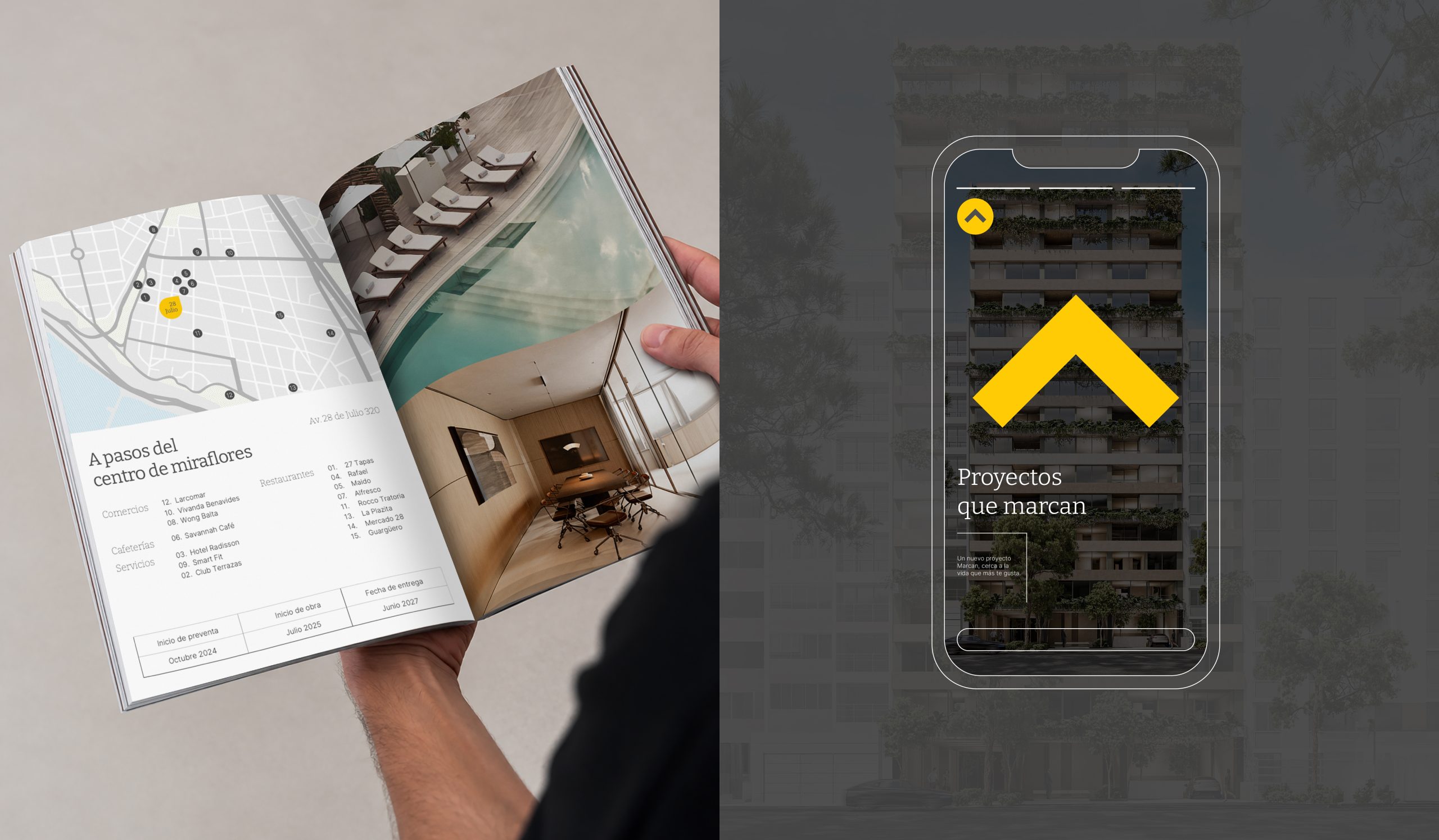
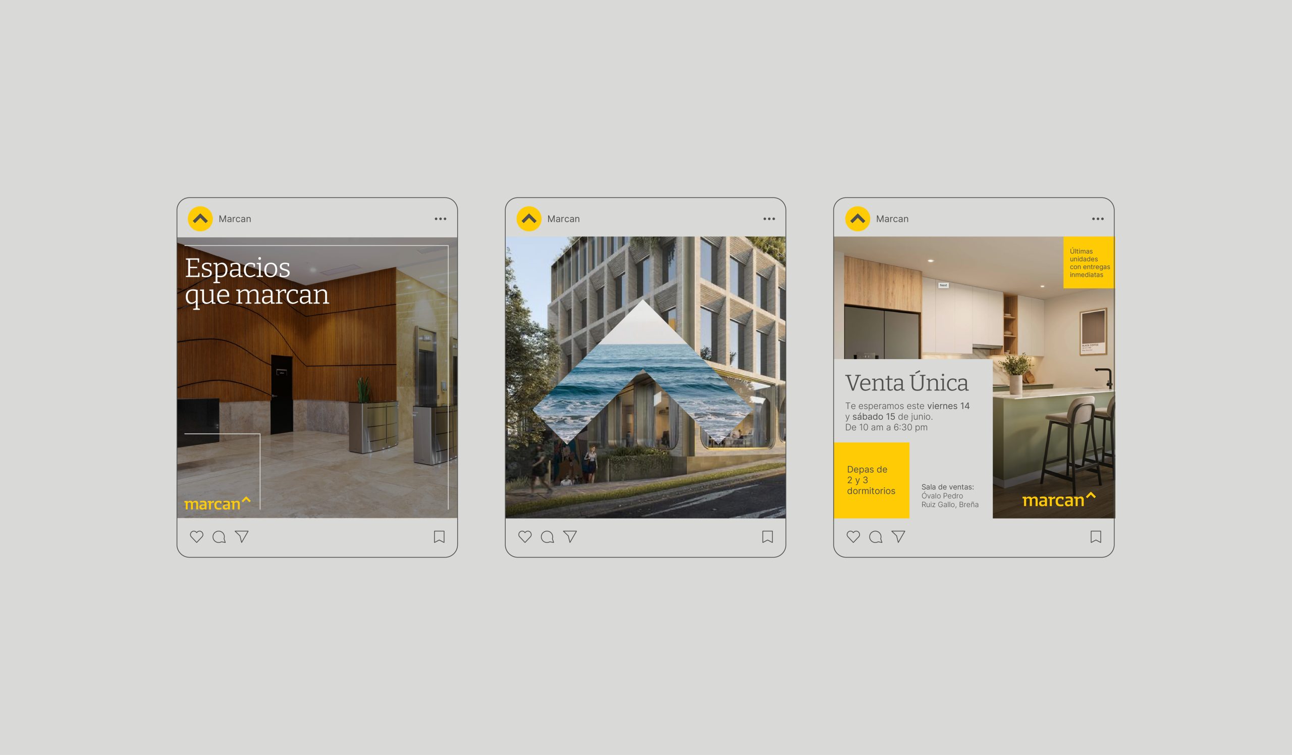
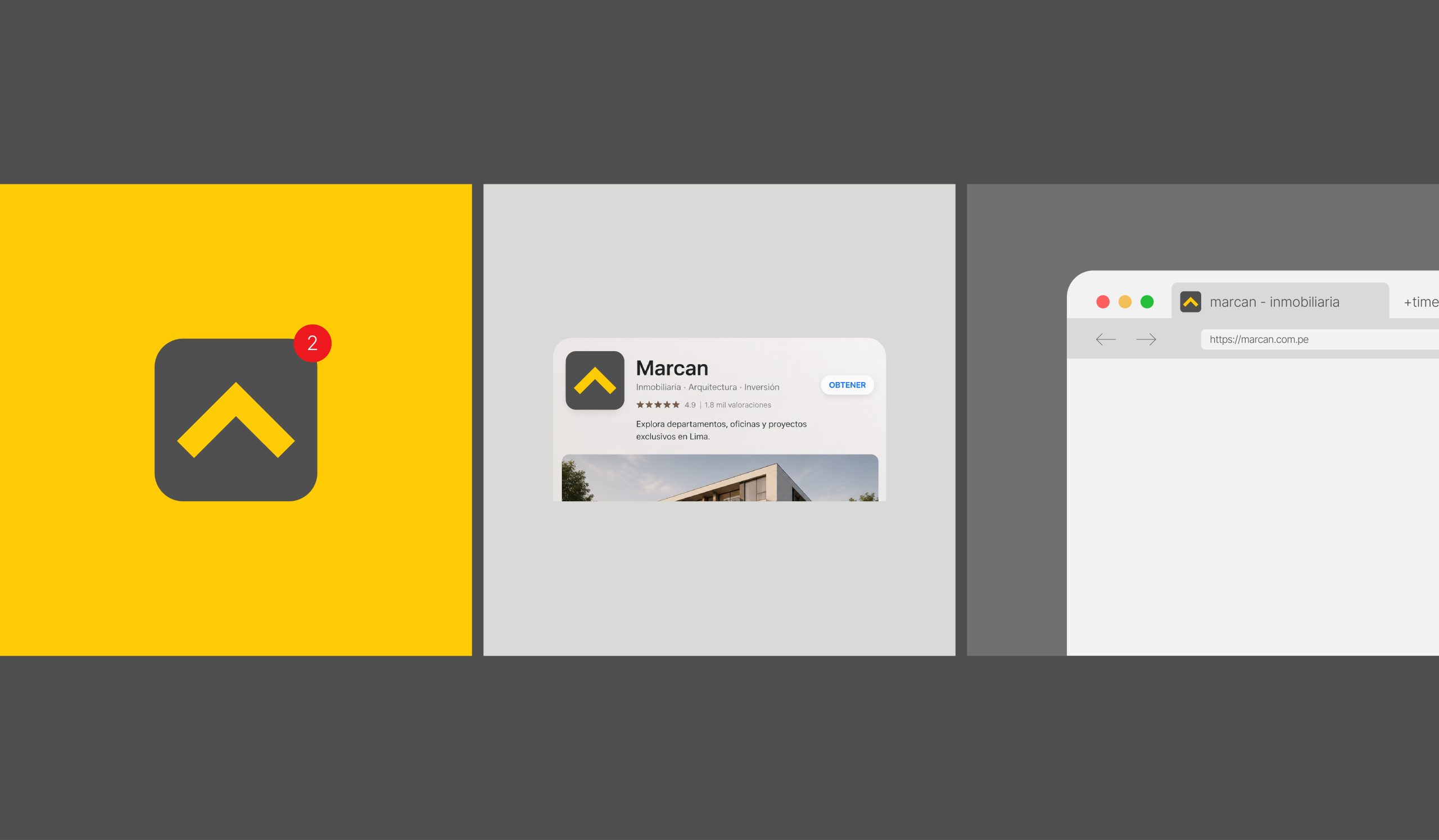
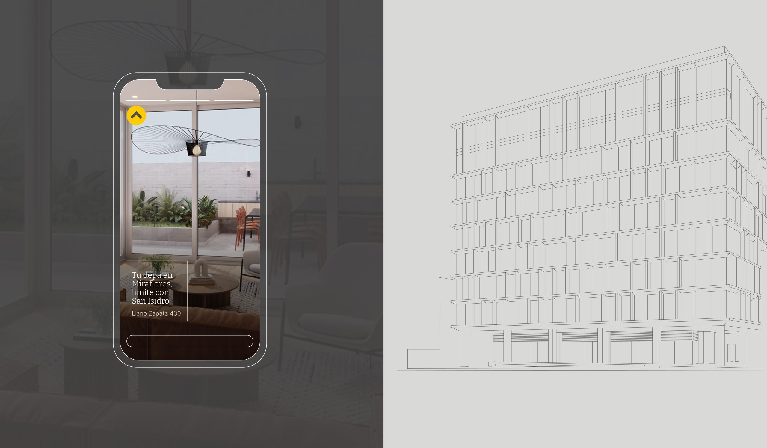
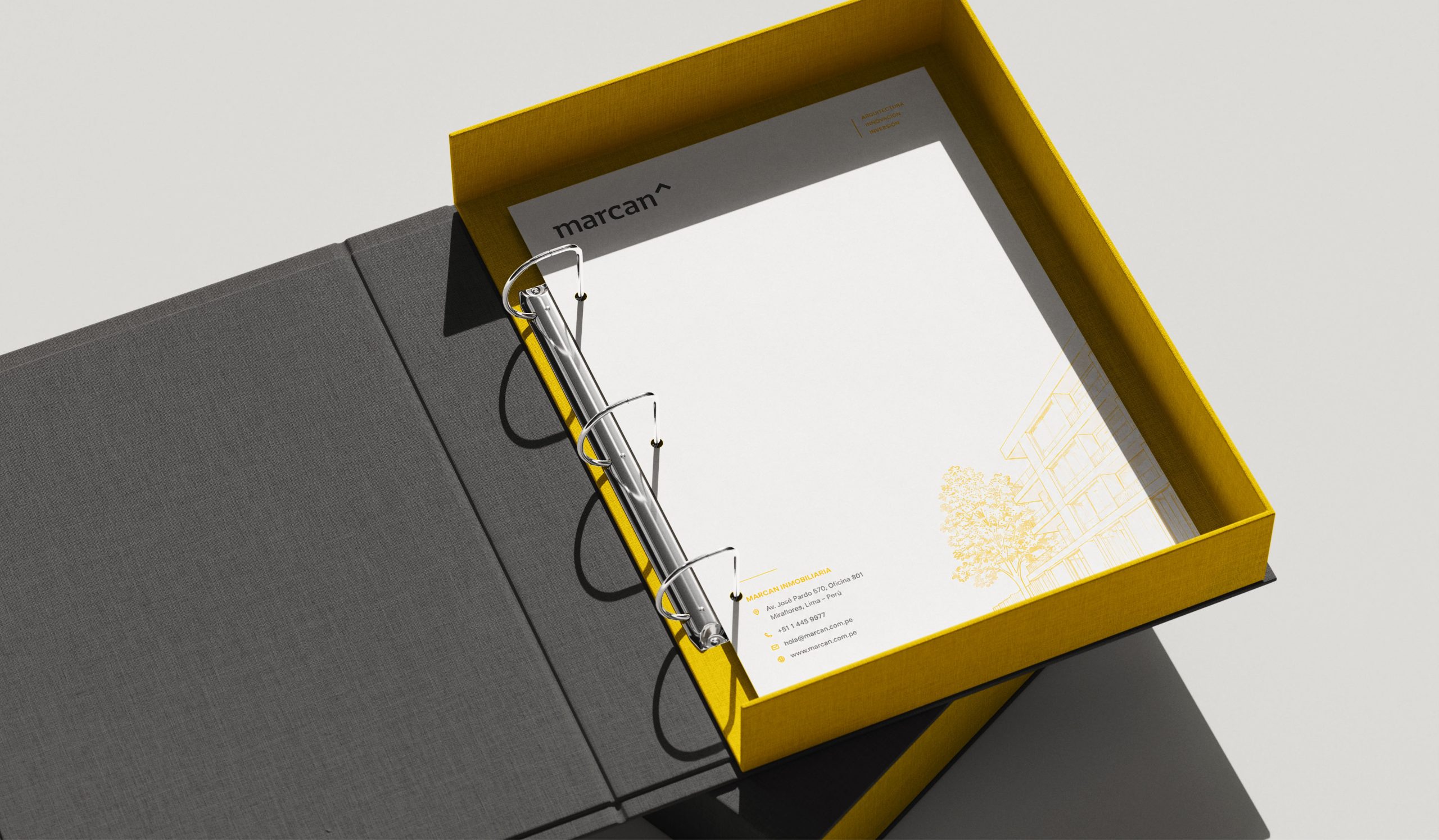
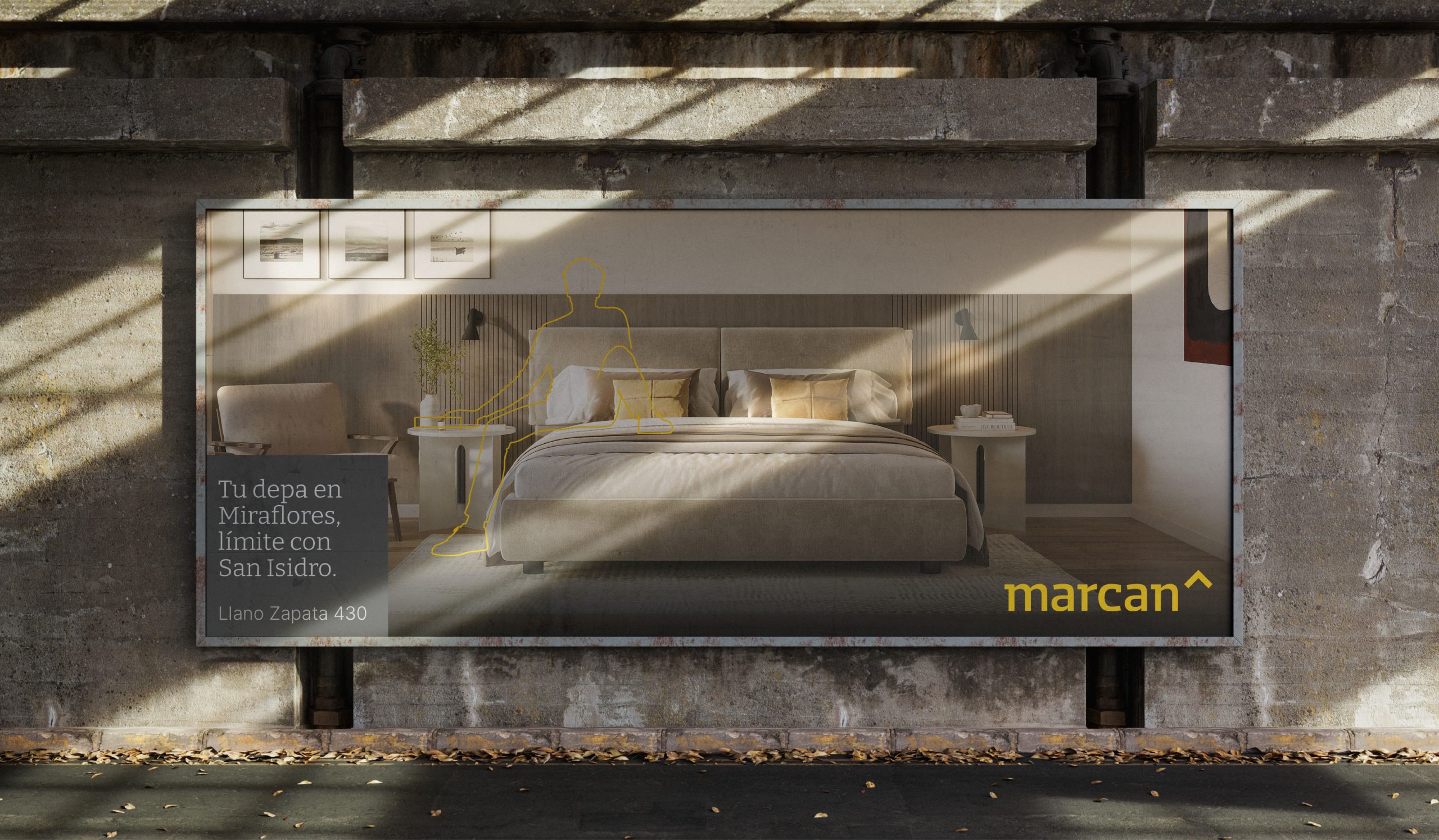
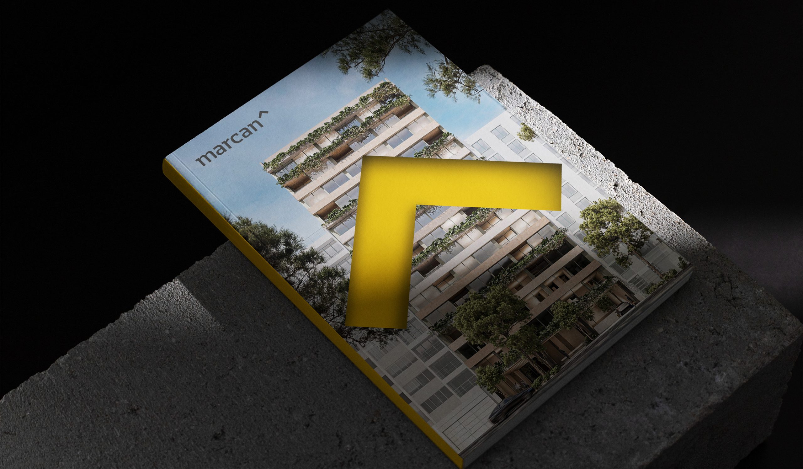
We started with its existing symbol, which already held part of the brand’s essence, and built a cleaner, more structured and recognizable visual system around it. We kept Marcan’s distinctive yellow while introducing a more subtle color palette, an elegant typeface and a system of outlines inspired by precision and attention to detail.
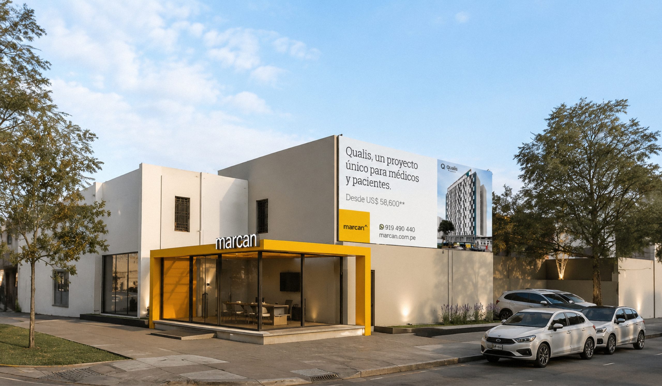
The result is a more iconic, solid and recognizable brand, with an identity capable of visually expressing what Marcan was already demonstrating through its projects.
A real estate branding project where the goal was not to create a new promise, but to make visible what was already there.
Because when a brand has something real to stand for, branding should help make it visible.

Services
- Strategy
- Visual Identity
- Web Design
Industry
- Real State
- Strategy & Creative Director: Daniela Nicholson
- Design Director: Jose Bernal
- Graphic Designers: Angelo Guillen and Romina De’ Luise
- Project Coordinators: Thiara Cobos and Eliana Garcia