Services
- Branding
- Naming
- Creative Direction: Daniela Nicholson
- Design Direction: Jose Bernal
- Graphic Design: Andrea D’Angelo
Industry
- Social
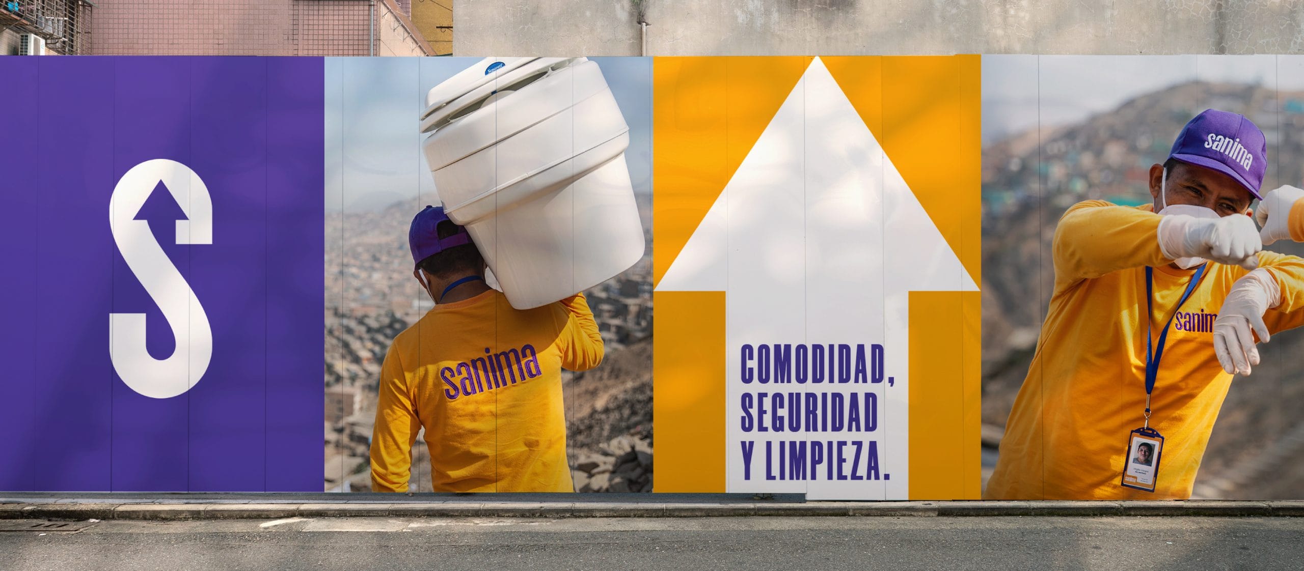
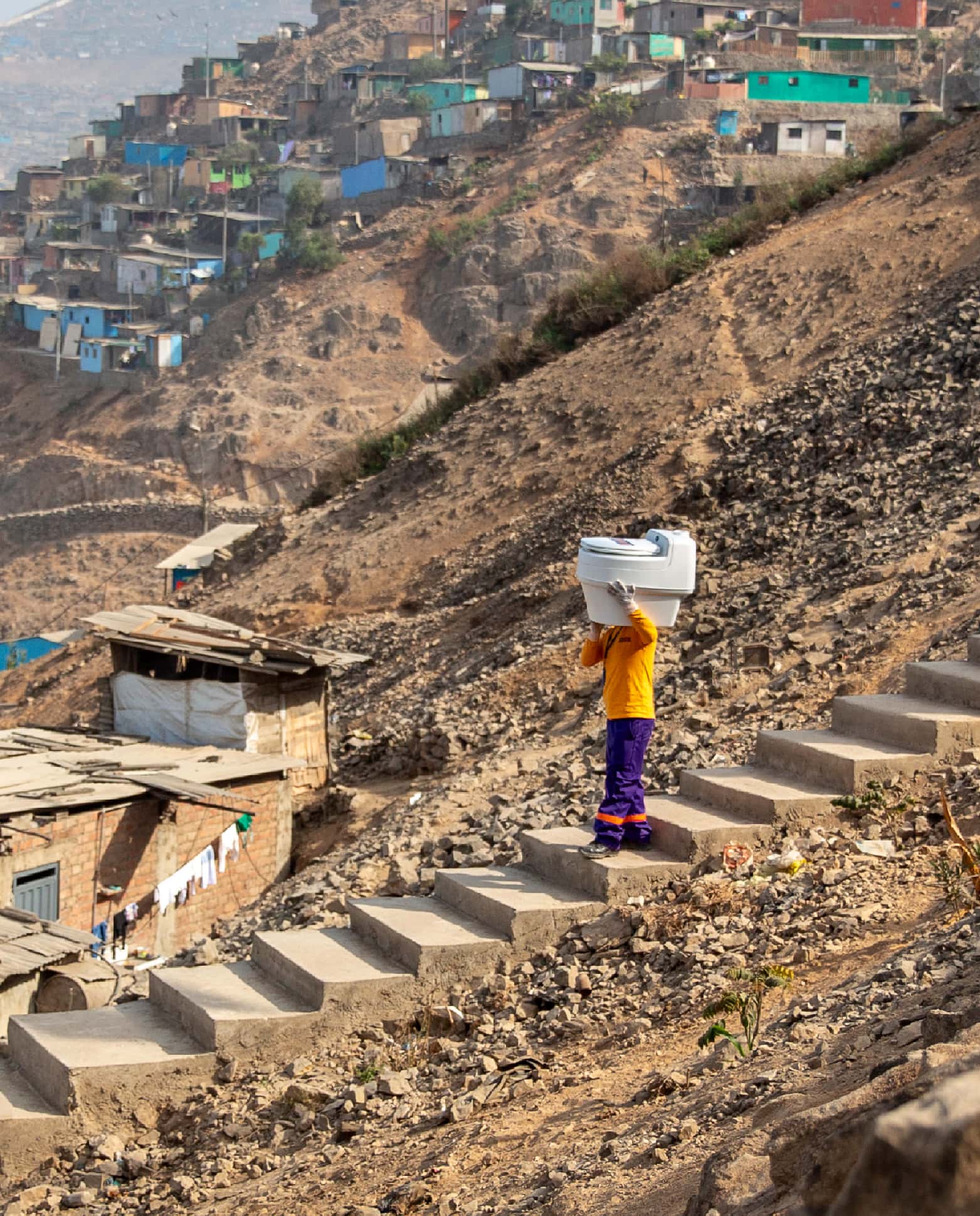
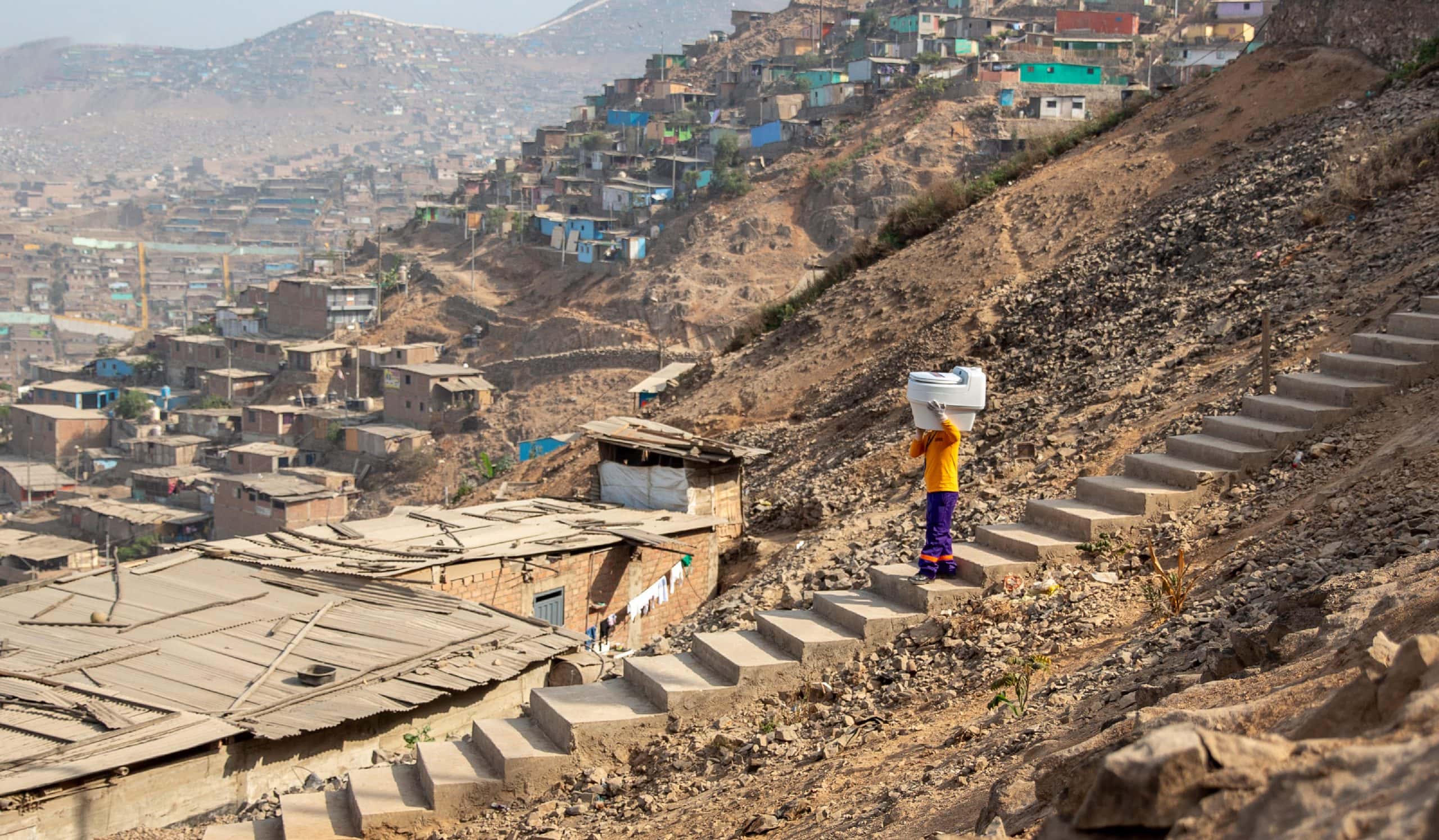
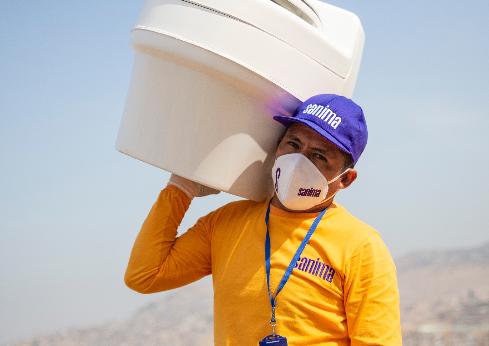
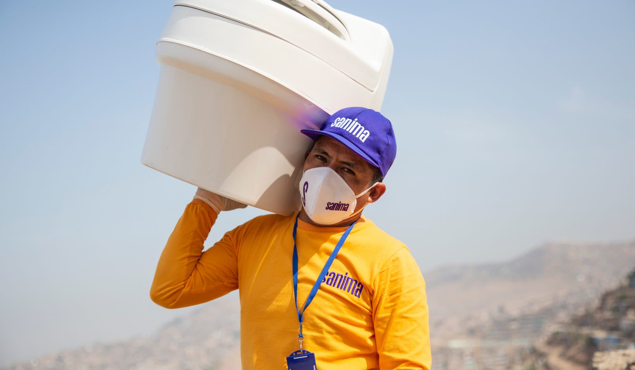
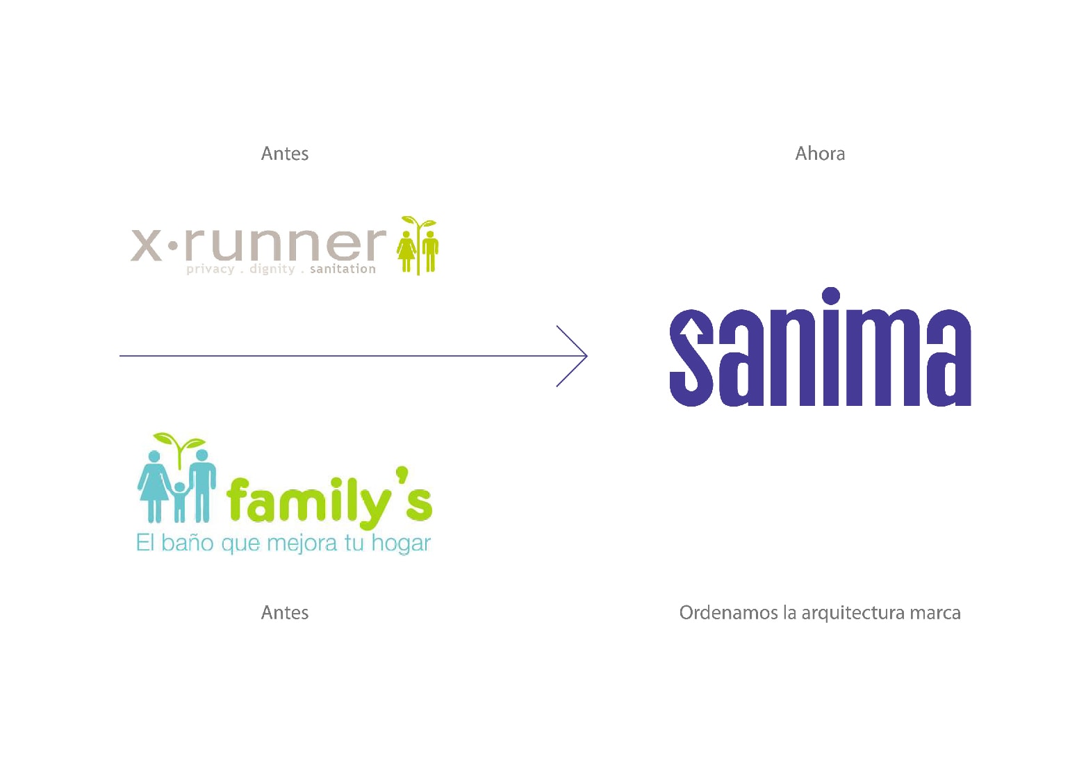
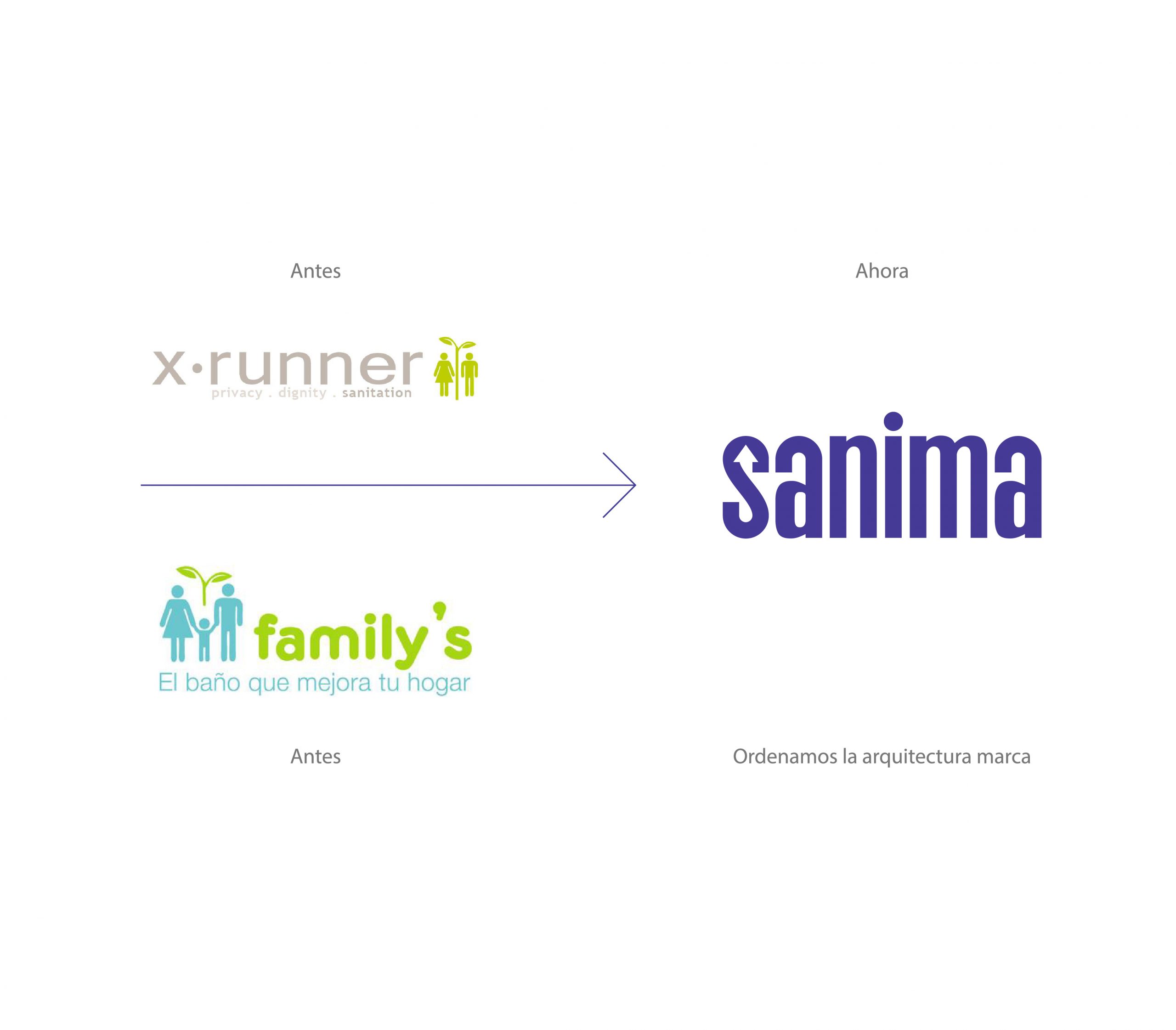
Lima is a mega-city in the middle of the dessert, where water is scarce and millions of people live with no access to drain service. ISabel Medem and their team came to our lives to teach us that problems, even the biggest, have a solution.
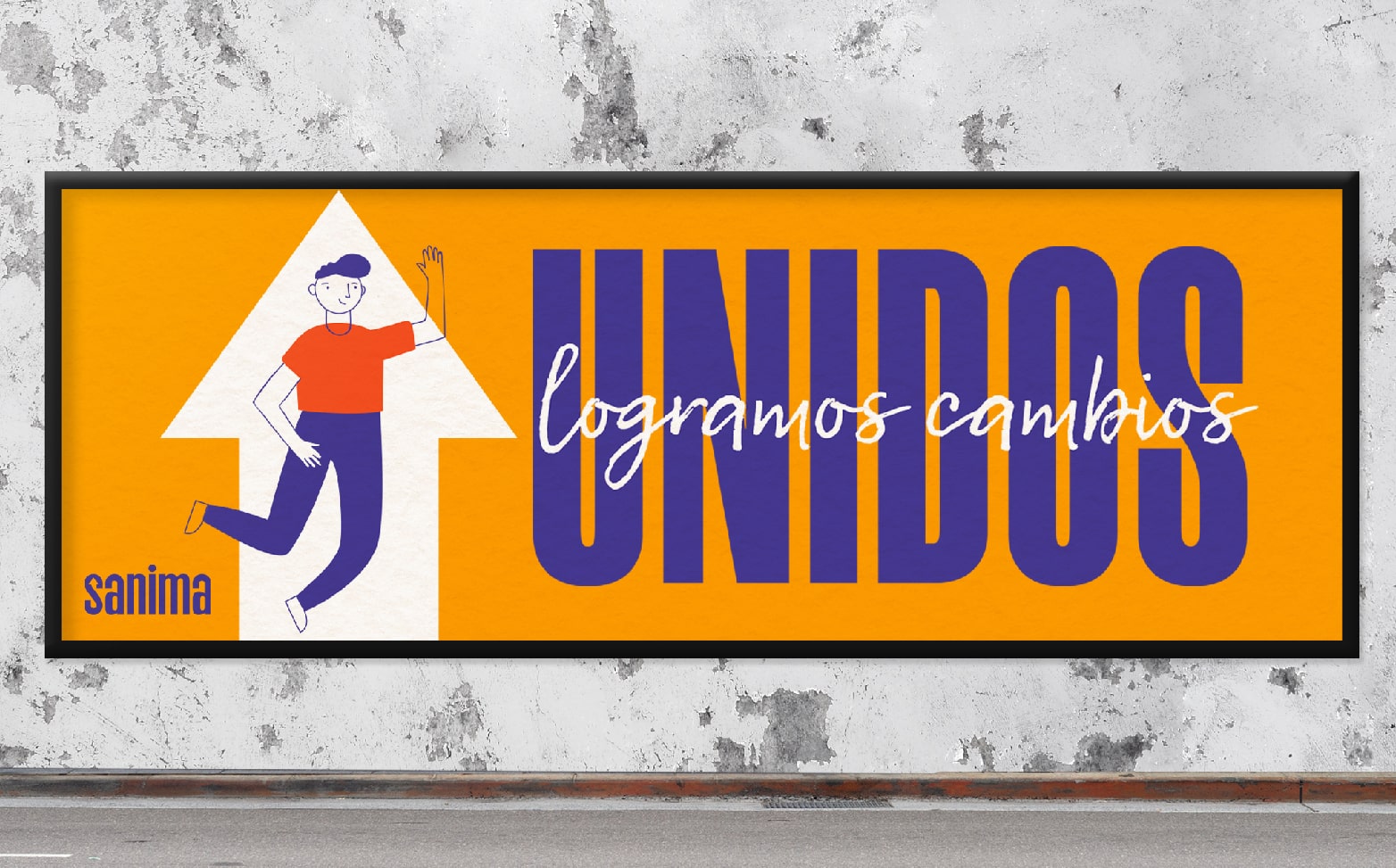
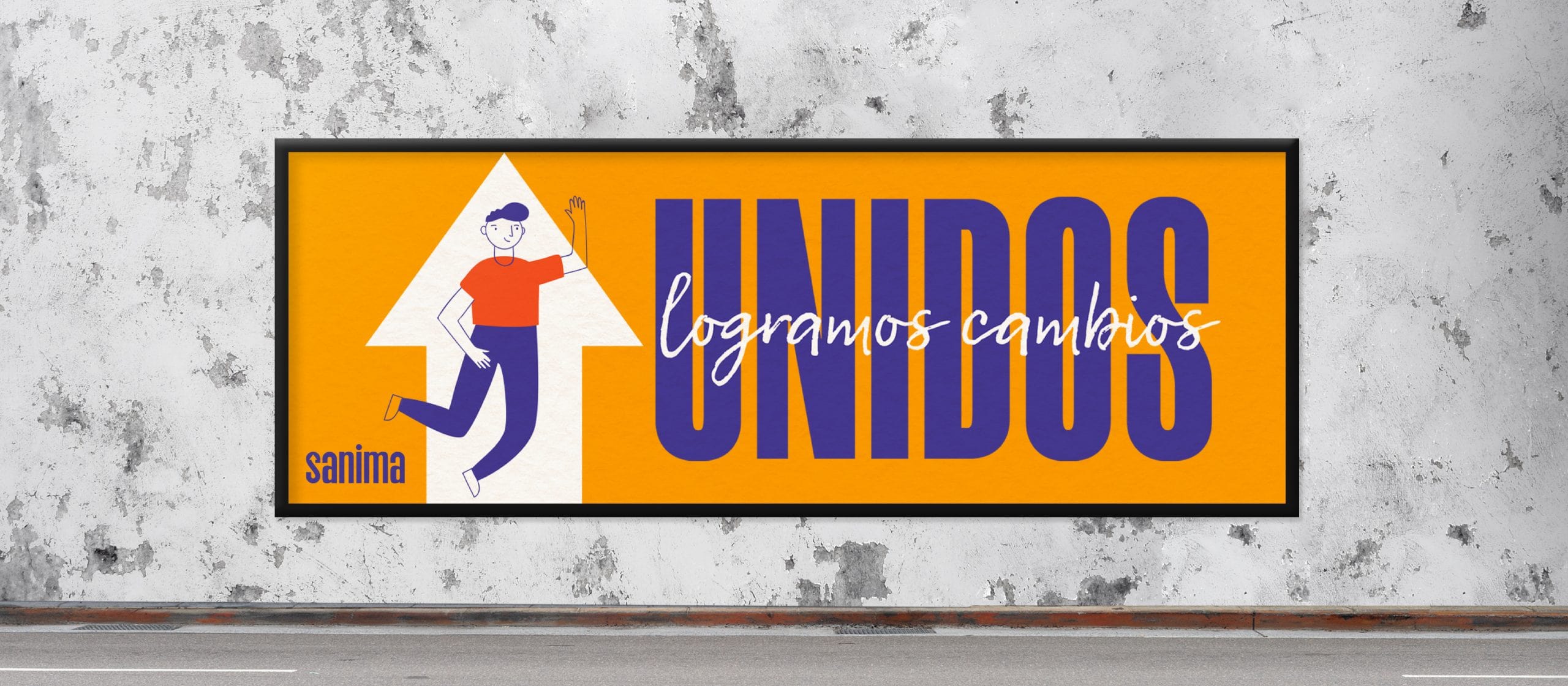
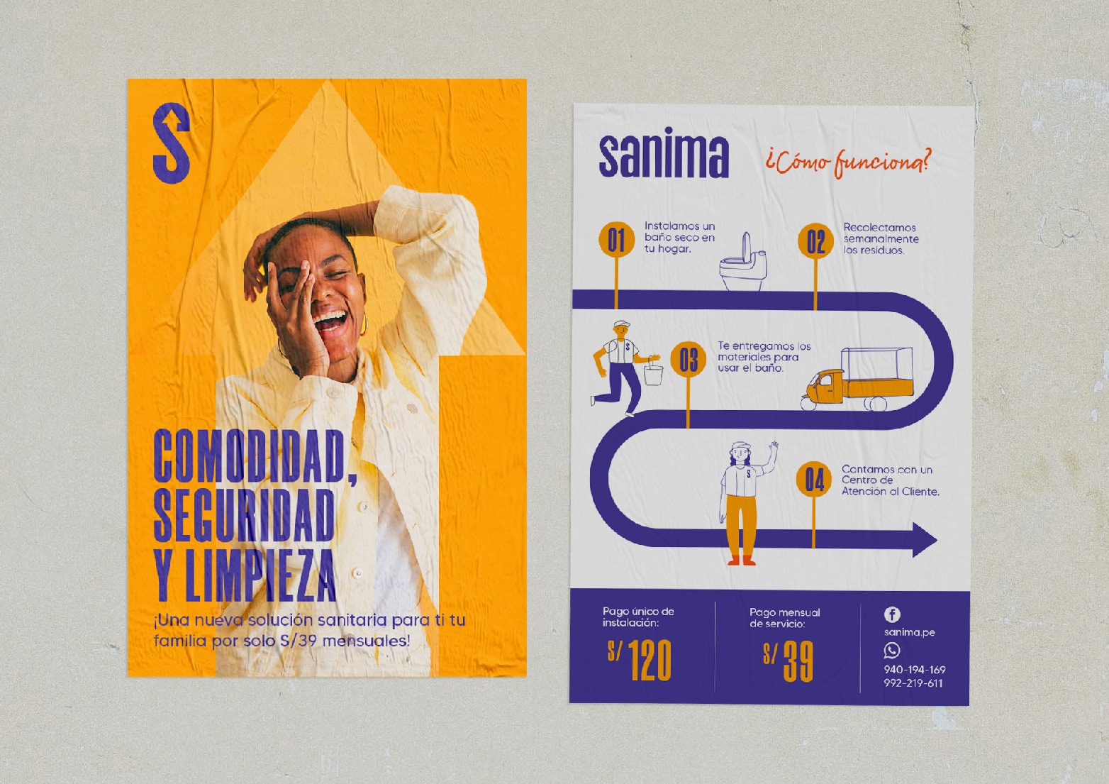
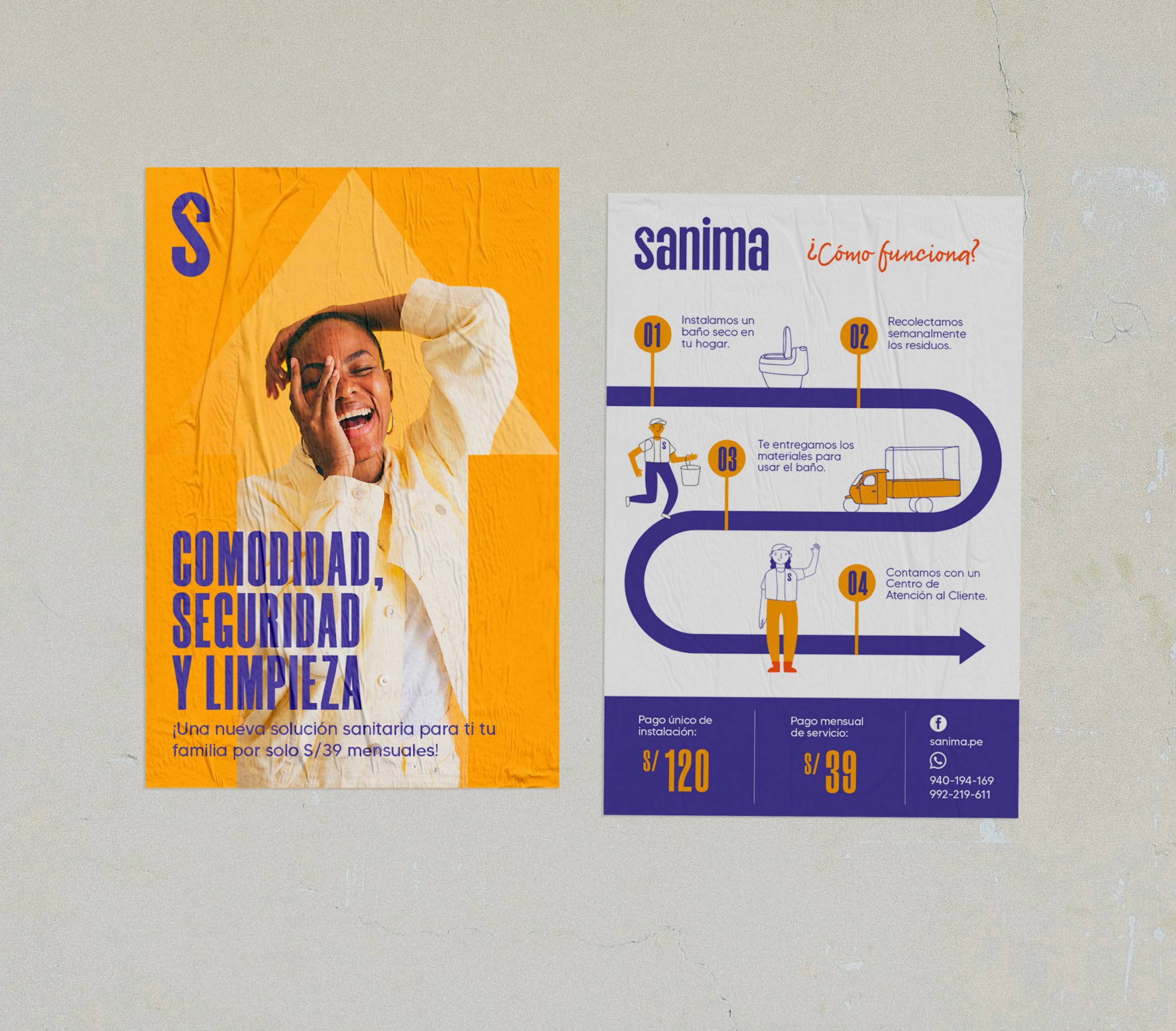
They called us to solve two problems: The confusion that generated the presence of two brands within a same business (X-runner and Family’s) and the need to boost their Visual Identity. “Sanima” is the new name we gave to this brand that offers decent drain services (a dry toilet that doesn’t need water or drain) and gives a will to progress to families from the most vulnerable areas of Lima.
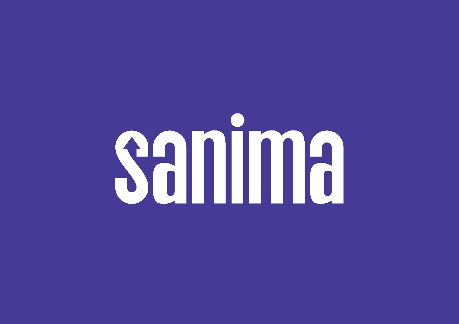
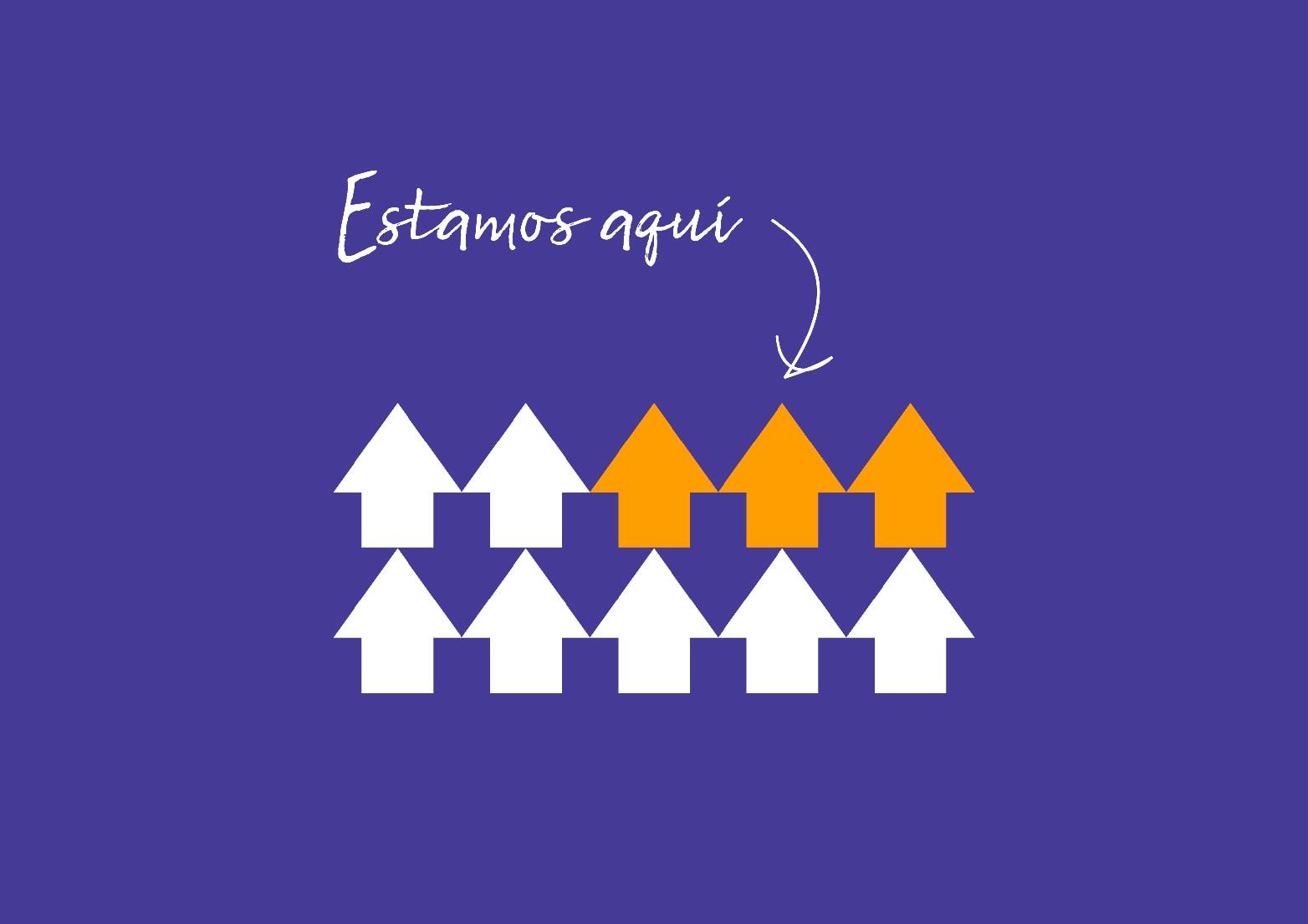
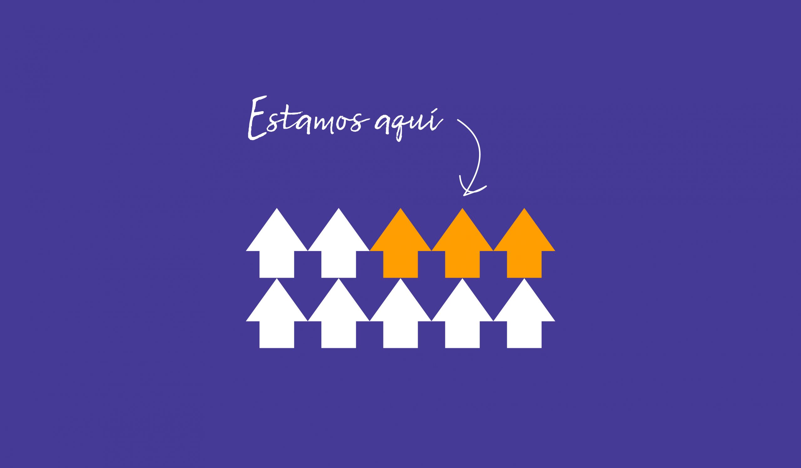
We proposed an arrow as the symbol, it looks like the letter S and goes up, because this brand puts forward solutions, that’s why it uses colors full of light and hope too.
Services
- Branding
- Naming
Industry
- Social
- Creative Direction: Daniela Nicholson
- Design Direction: Jose Bernal
- Graphic Design: Andrea D’Angelo